

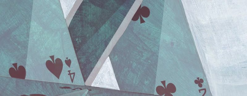
This has to be one of the most enjoyable books I've read. The film adaptation is also fantastic in its own right, but I found there to be so many more funny, moving and intricate moments in the novel. Creating a visual identity for the story was a really fun challenge. Naturally there were dozens of different images to choose from... pills, uniforms, clockwork machinery etc. But in the end I felt that a deck-of-cards would be the most appropriate metaphor - the card tower on the front representing the structured regime of Nurse Ratched, and the chaotic composition on the back symbolising McMurphy's rebellious behaviour.
2 comments:
Absolutely love this idea, really great metaphor! Good luck with it :)
I tell you what, if I saw this in a bookshop I'd be drawn straight in to have a closer look. The texture works really well, and I really like how you've played with the layout to give extra depth to the image (the shadow of the card and the card overlapping the text box on the back)
I think you're a shoe in Finn!
Post a Comment